Biztory


A New Chapter for Accounting at Biztory
Redesigning an aging accounting platform into a modern, intuitive experience built for clarity, usability, and scale.
“Accounting is the language of business.”
Warren Buffet
AMERICAN INVESTOR
By 2022, Biztory Cloud Accounting's interface had become visually outdated and increasingly difficult to navigate, resulting in suboptimal user experience. At the same time, competitors like Bukku and Autocount were rapidly gaining traction with more modern, intuitive, and user-friendly designs.


Challenge #1
How Do You Transform an Aging UI Without Breaking the Experience?
Designing the Future of Accounting at Biztory
The transformation of Biztory began with a simple but pressing realization: the product we had built no longer reflected the expectations of modern accounting users. What was once functional had slowly become a source of friction.
We started by looking inward and examining the existing interface not just as designers, but as everyday users navigating real accounting tasks. It quickly became clear where the experience was breaking down: cluttered layouts, unclear hierarchies, and workflows that required more effort than they should.
To ground our assumptions in reality, we partnered closely with the Customer Support team, uncovering recurring complaints and patterns in user frustration. At the same time, we looked outward by studying competitors who were gaining traction with cleaner, more intuitive experiences.
This dual lens gave us a clear direction: Biztory didn’t just need a visual refresh. It needed a fundamental shift in how accounting workflows were designed, experienced, and understood.
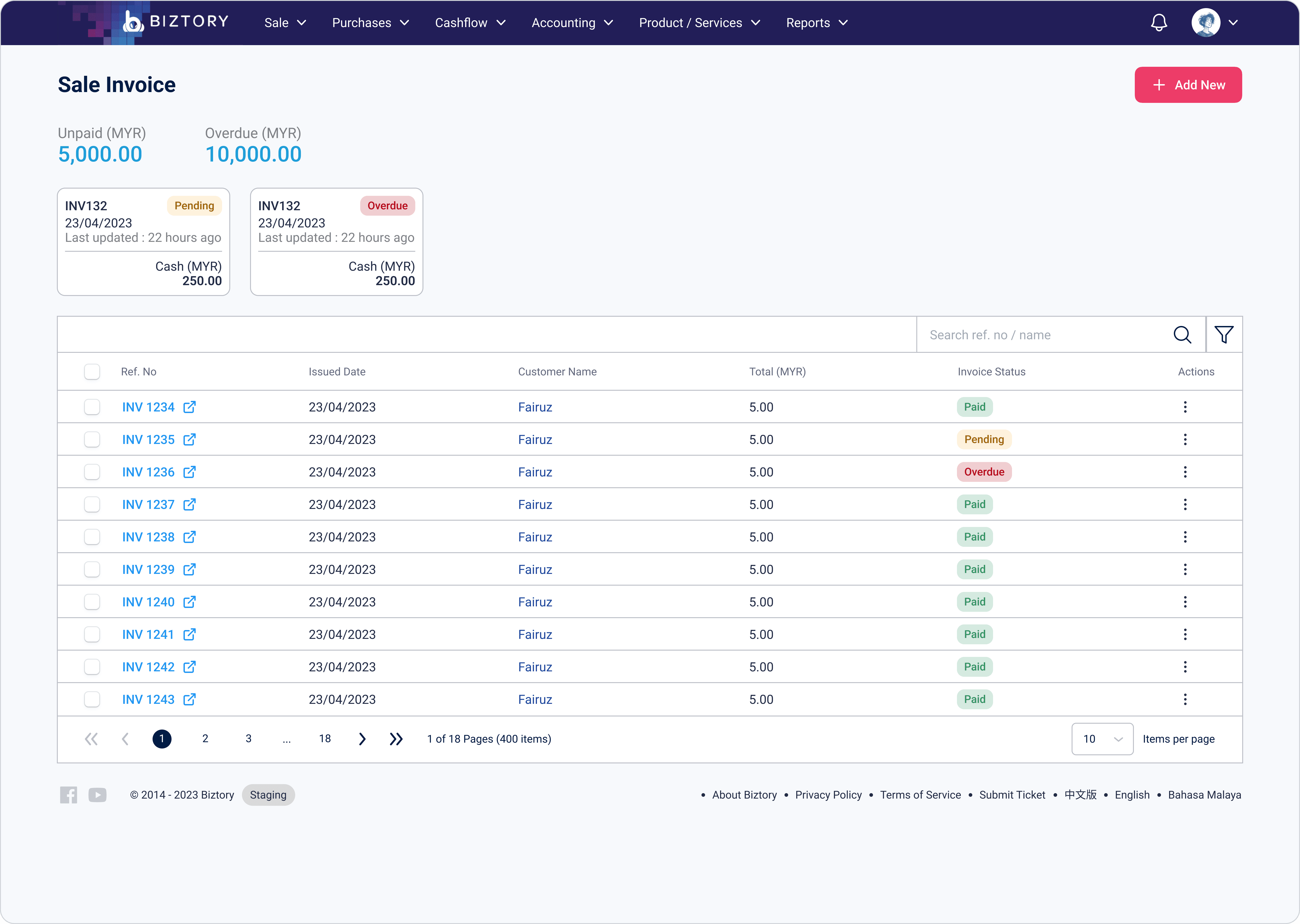
Old Table
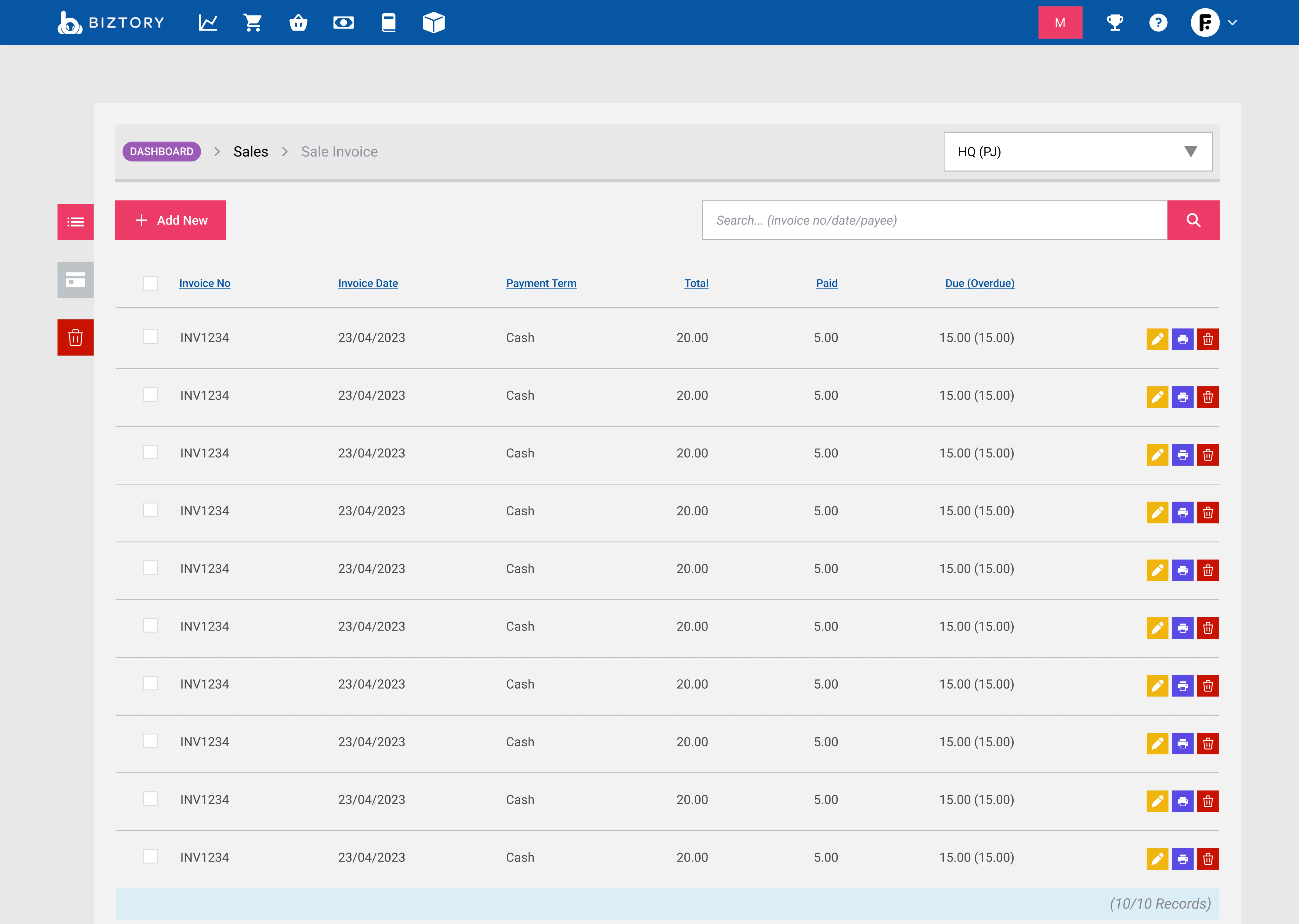
New Table

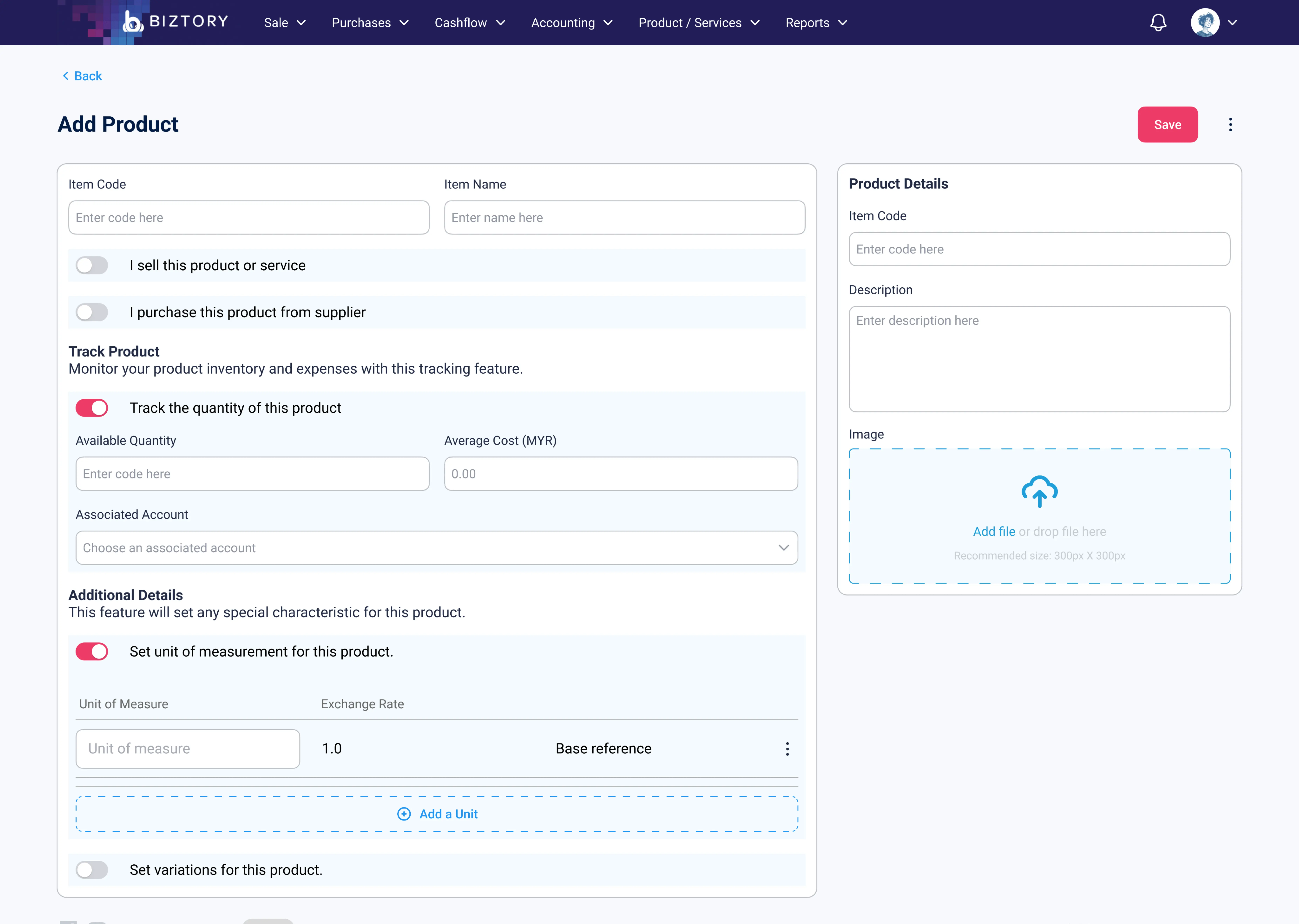
Old Setup
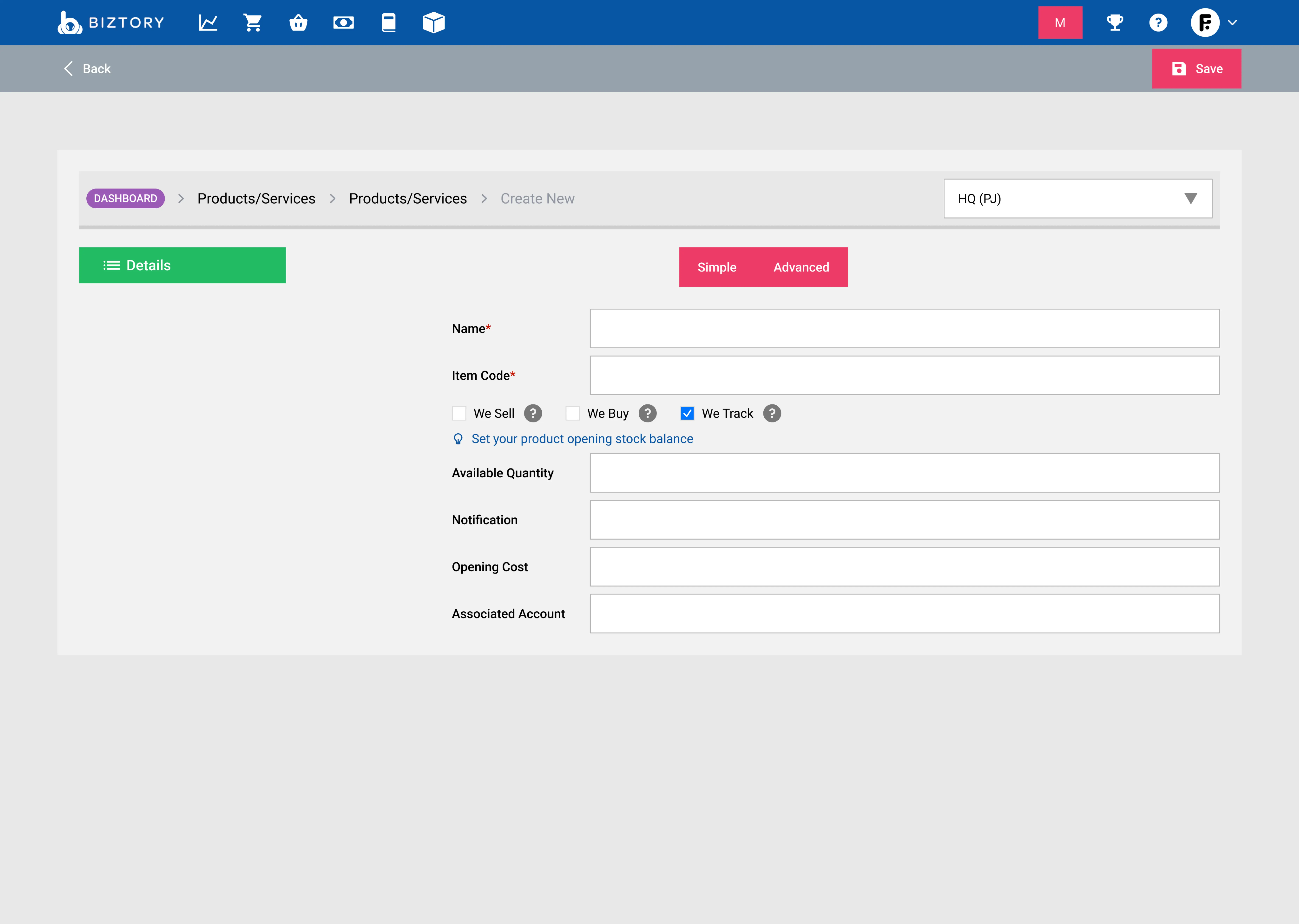
New Setup
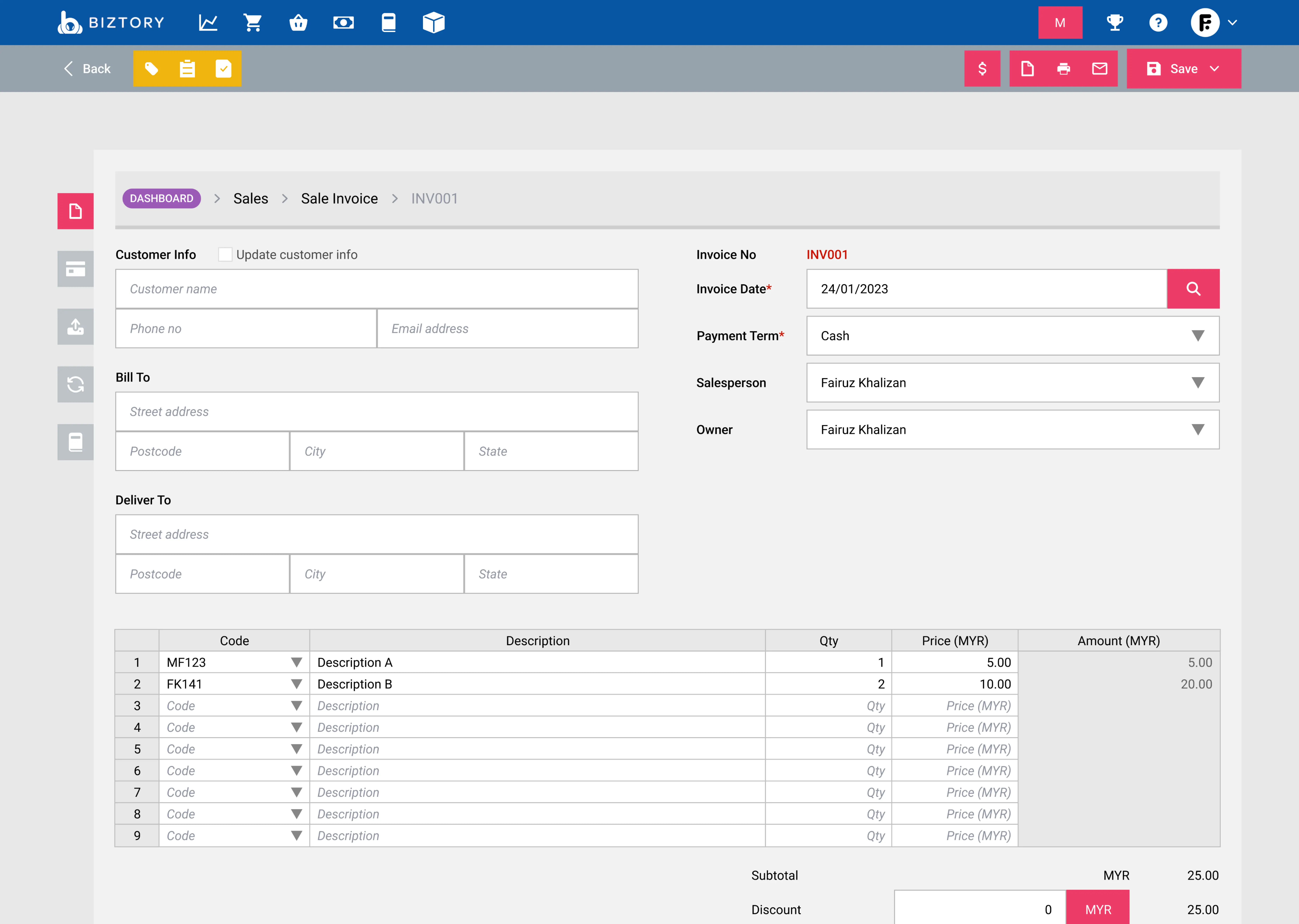
Old Invoice
New Invoice
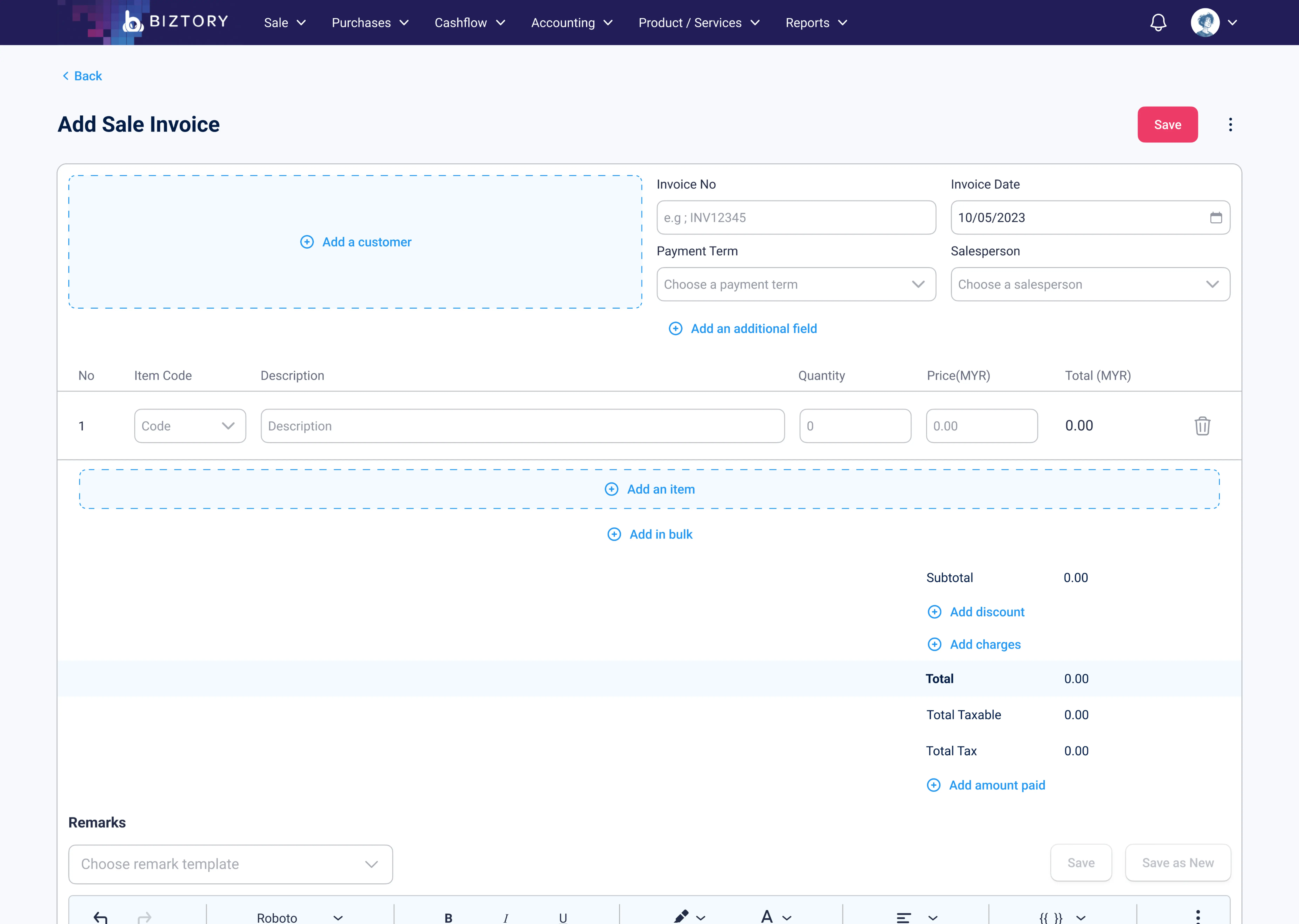
One of the key challenges in this project was modernizing Biztory's interface without alienating its existing users. While the product clearly needed a visual and usability upgrade, a complete overhaul risked disrupting users who had already grown familiar with the system.
To address this, the approach was to evolve rather than redesign from scratch. Core layouts, mental models and interactions were carefully retained while the visual clarity, hierarchy and usability were progressively improved.

Challenge #2
How Do You Scale a Product Without Making It More Complicated?
Designing for Subscription-Based Flexibility
As Biztory began to grow, so did the needs of its users. What started as a straightforward accounting tool was gradually expanding into a platform that had to support businesses at different stages, each with its own level of complexity.
Some users only needed the essentials. Others were willing to pay for more advanced capabilities. The challenge wasn’t just adding new features, it was doing so without overwhelming the very users who valued simplicity the most.
We quickly realized that building separate experiences for each tier would fragment the product and create long-term complexity. Instead, we needed a system that could grow with the user.
This led to a more modular approach. Features were designed as extensions of existing workflows that are contained, structured, and consistent. Rather than introducing entirely new interfaces, advanced capabilities could be layered on top of what users already understood.
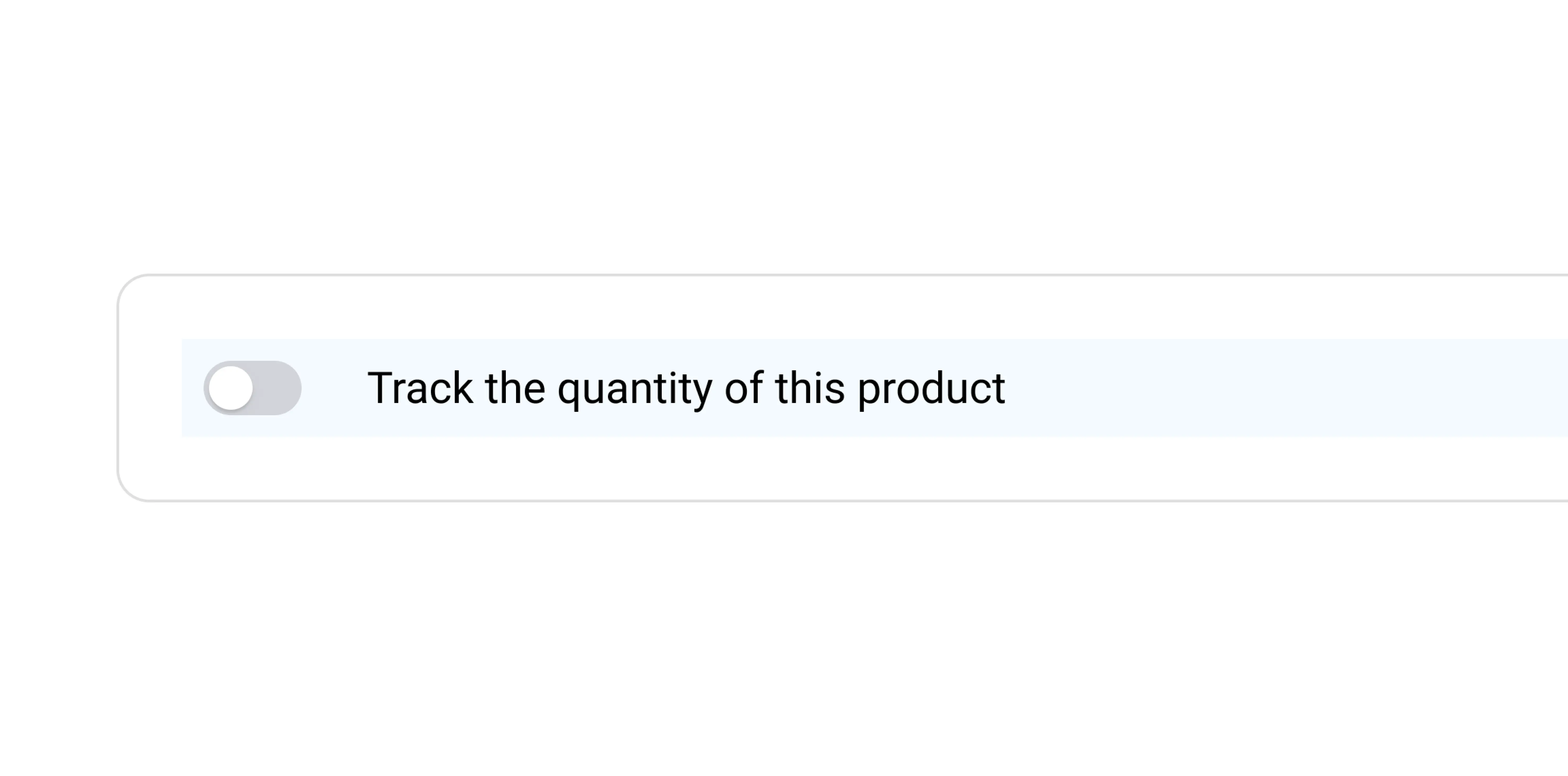
Base Subscription Users
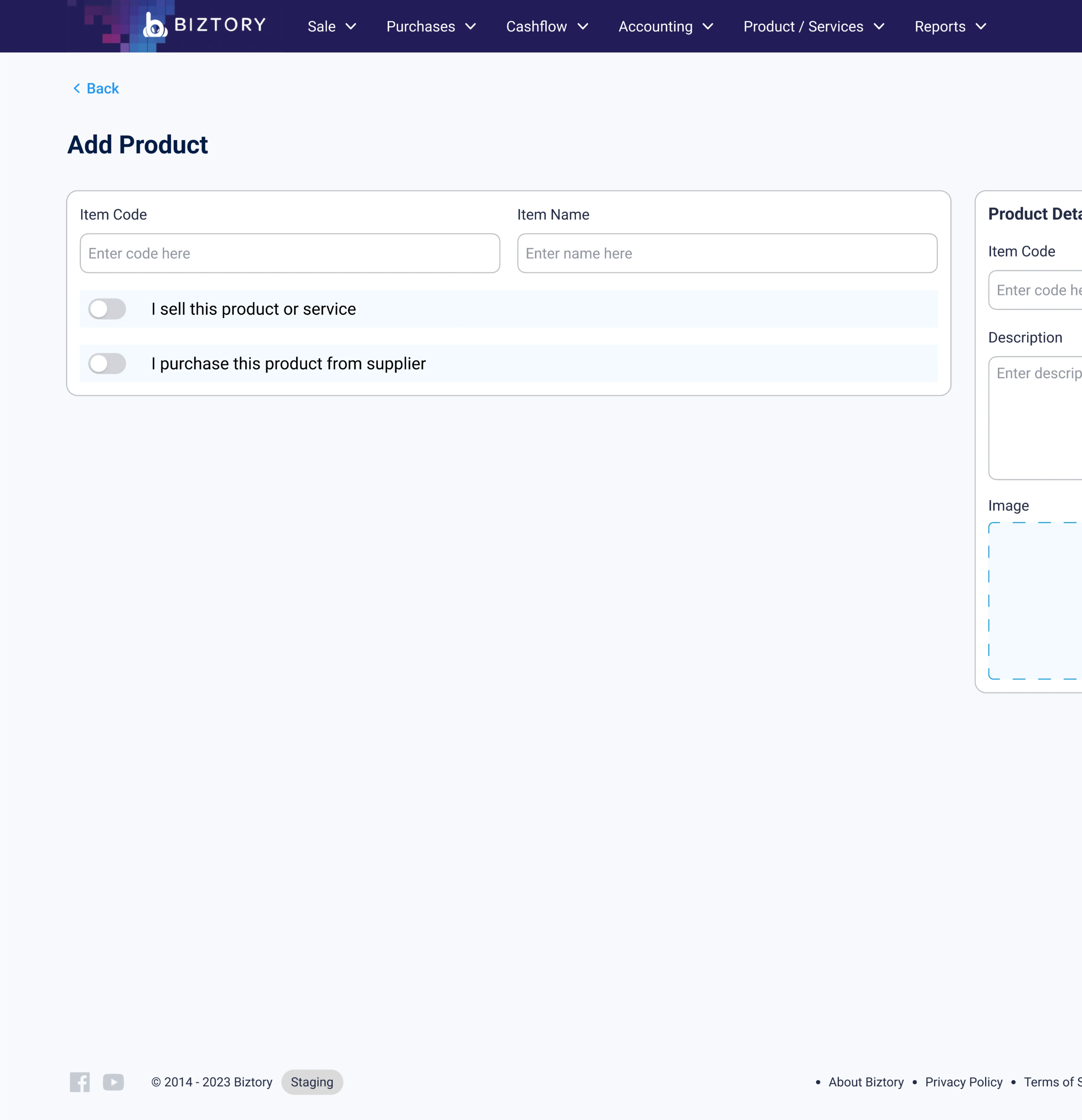
Higher Subscription Users
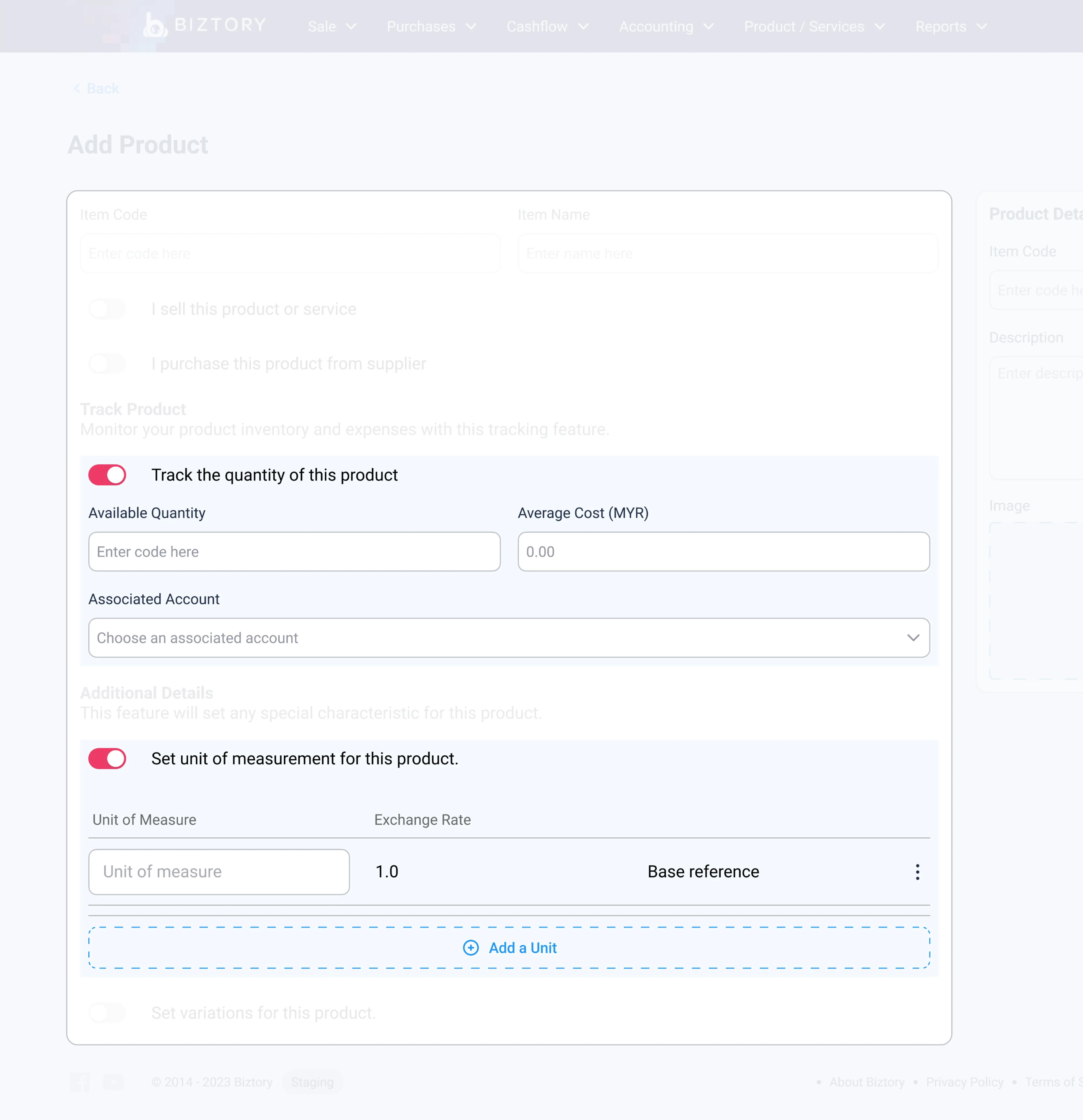
At the core of this approach was flexibility. Each feature could be toggled on or off, allowing administrators to control access based on subscription tiers. For users, this meant a cleaner interface that only revealed what was relevant to them. For the product, it meant the ability to scale without losing coherence.
In the end, it wasn’t just about adding features but it was about designing a system that could evolve without becoming more complicated.
My Impact to Biztory
The redesign had a measurable impact on both user experience and business outcomes. The number of support tickets was significantly reduced, indicating that users were able to navigate and complete tasks with fewer issues.
At the same time, overall customer satisfaction improved, reflected in stronger user feedback and consistent 5-star ratings. These outcomes validated that the design changes not only addressed usability challenges but also delivered a more intuitive and reliable experience for the users.