
ReXharge

Designing an EV Platform from the Ground Up

Making EV charging simple, reliable, and easy to access for everyday drivers.

“The key to making electric vehicles work is charging infrastructure.”

Elon Musk

CEO, TESLA & X

As electric vehicles gained traction in Malaysia, Rexharge entered the market with a vision to build a reliable and accessible charging network. But in a space where trust and convenience are key, infrastructure alone wasn’t enough.

Challenge #1

Should Charging Start with a List or a Location?

Starting Where the Driver Is

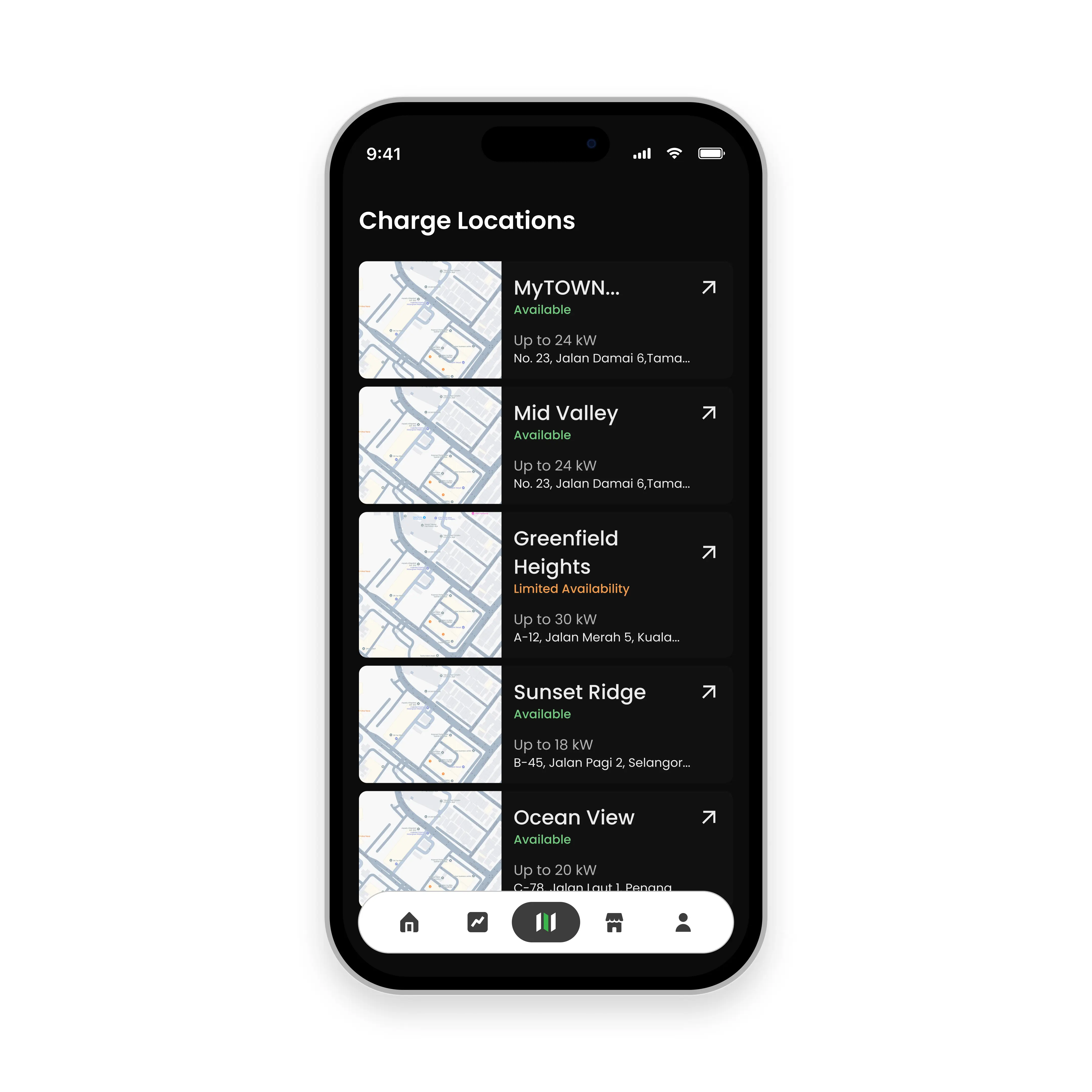
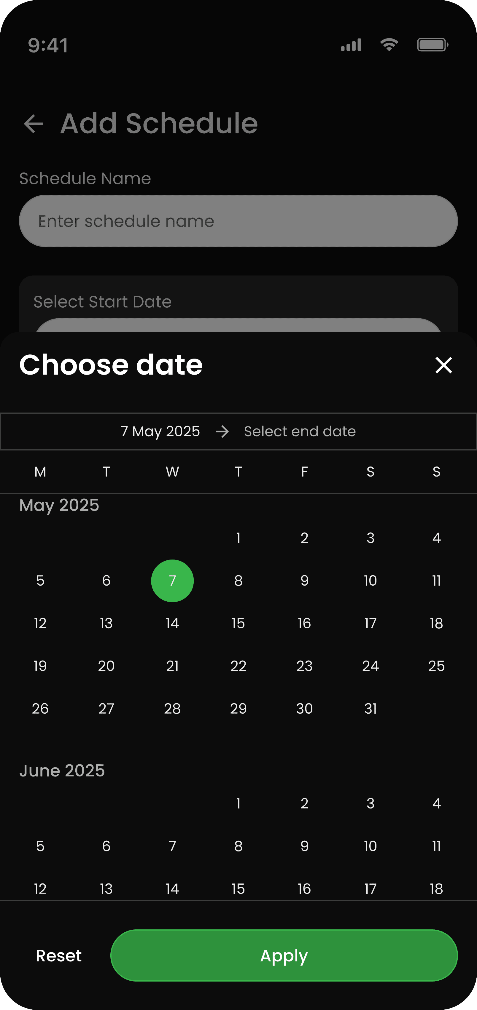
The homepage didn’t start with a map—it started with a simple list of charging locations. At the time, we hadn’t fully figured out how the map experience should work, so we focused on what we could build: a functional list that helped users browse available chargers.

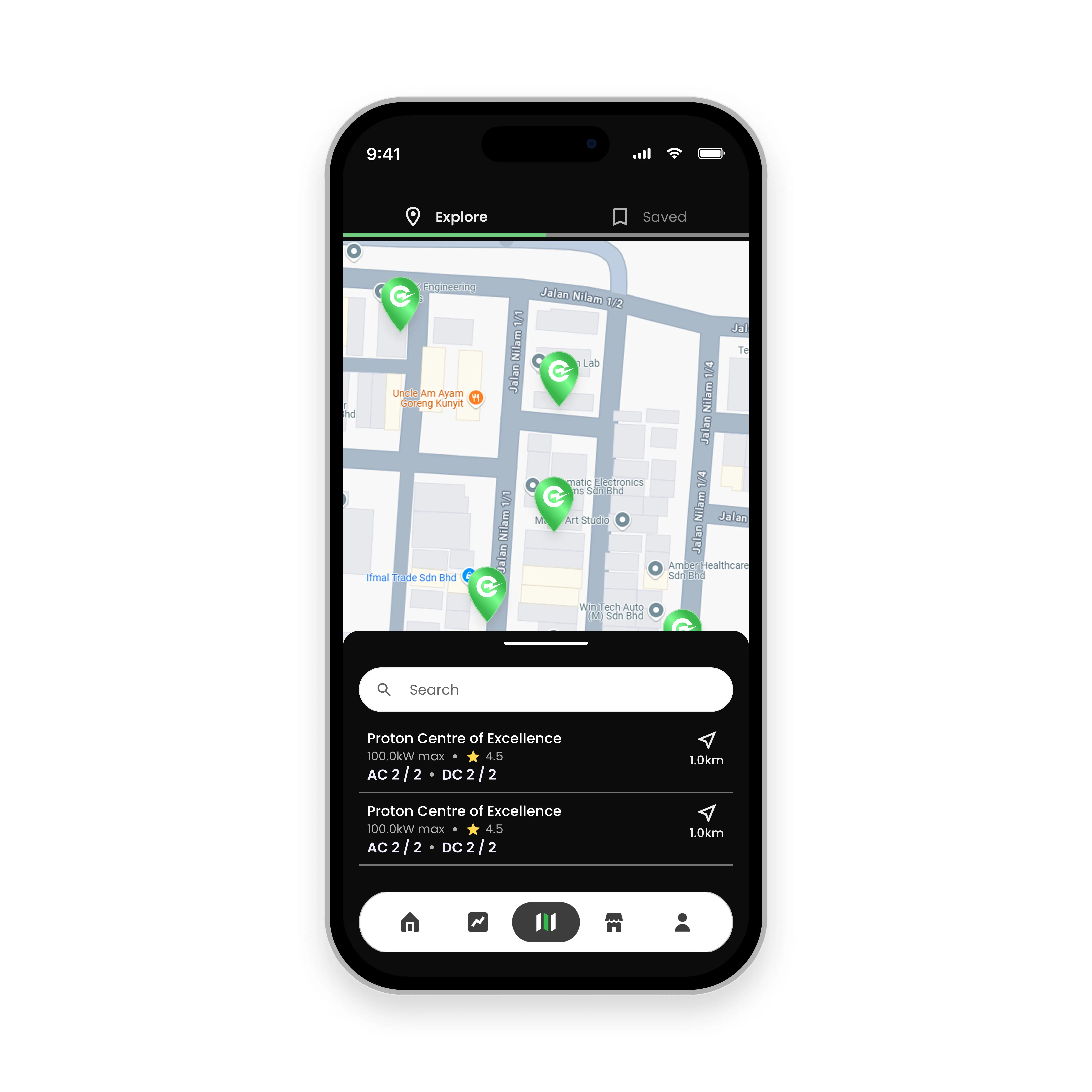
As the product evolved, we introduced logic to surface the closest locations to the driver, while still allowing them to switch and explore other options. It worked, but something felt off. We paused and asked a more fundamental question:What is the user actually trying to do the moment they open the app?

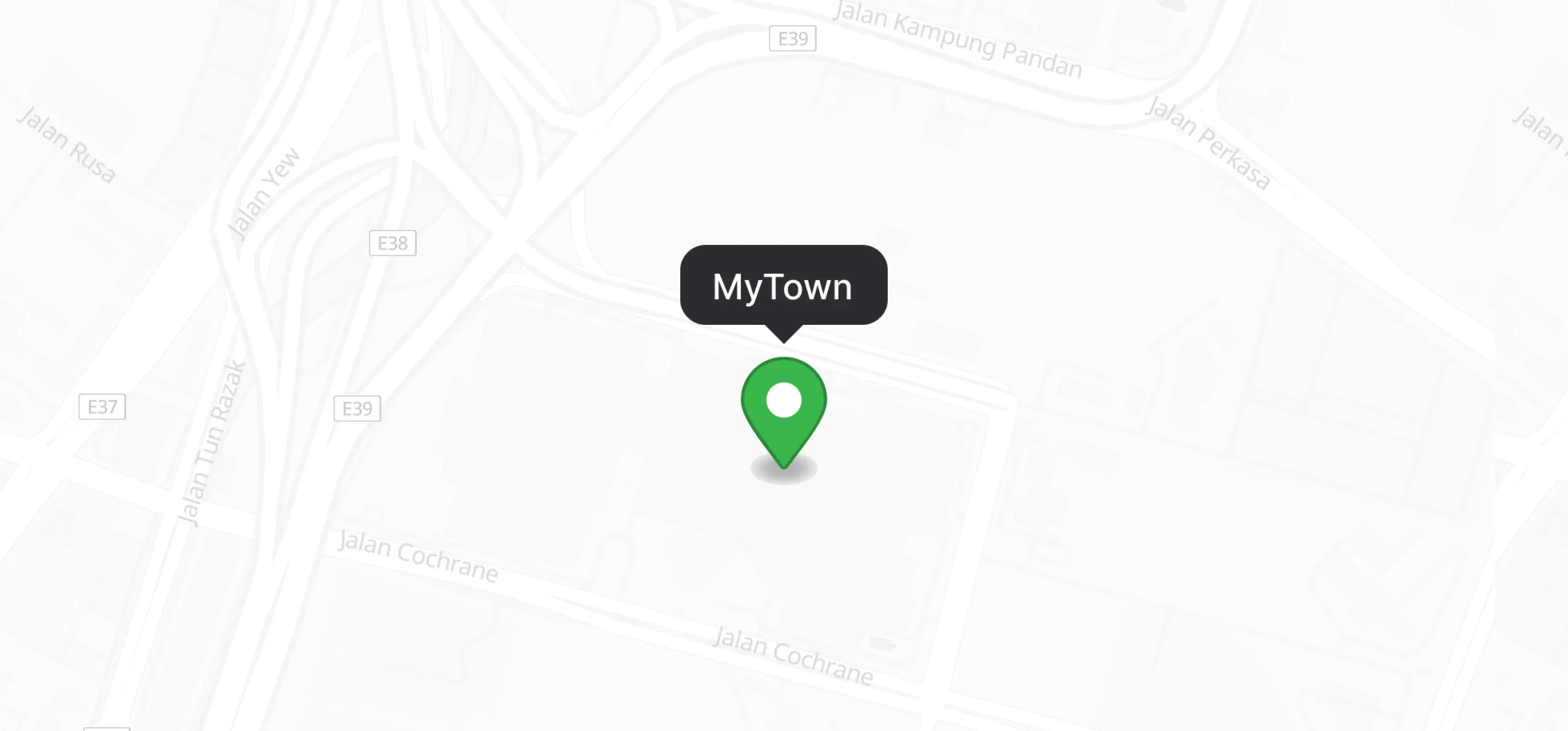
Version 1

Version 2

Version 3

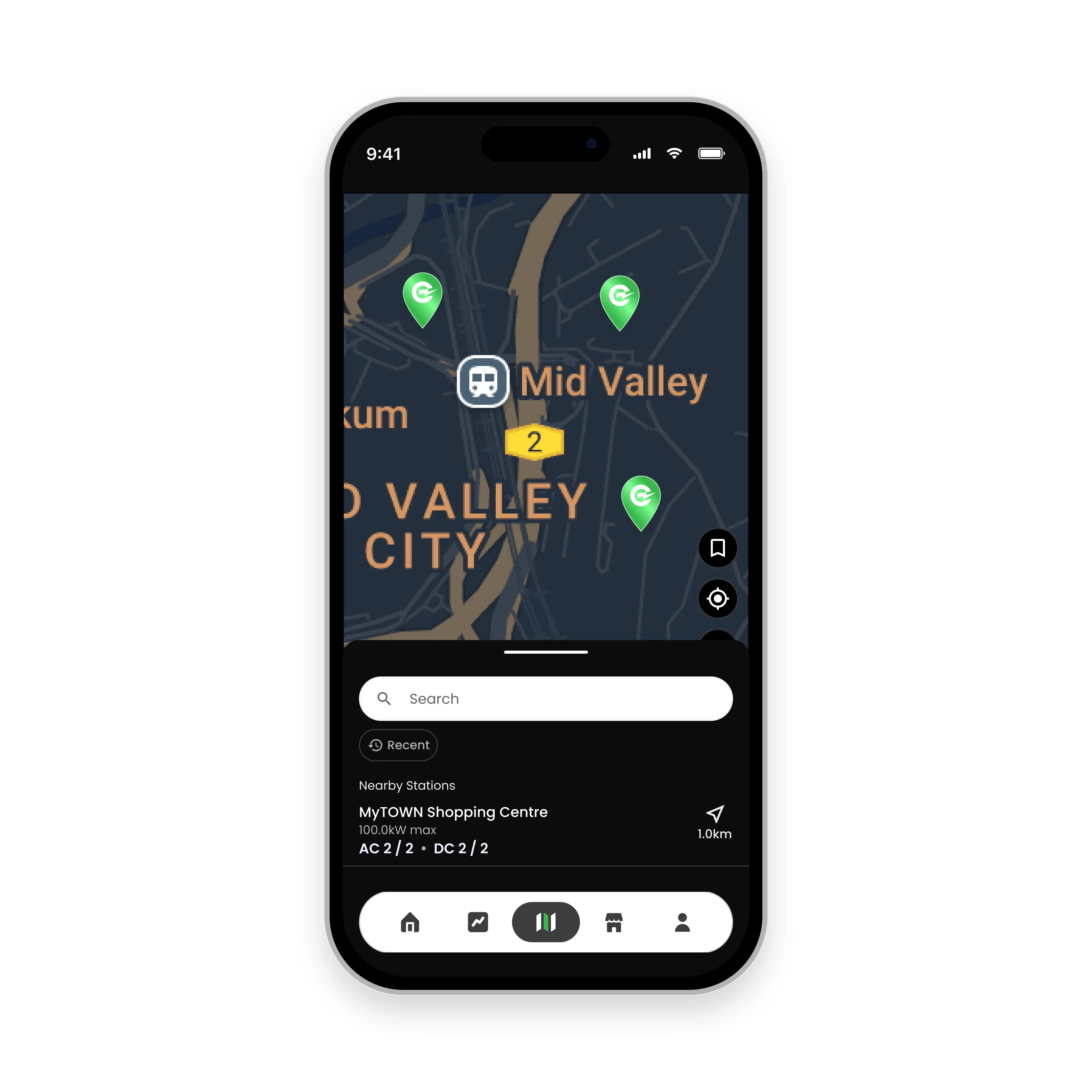
Final Version

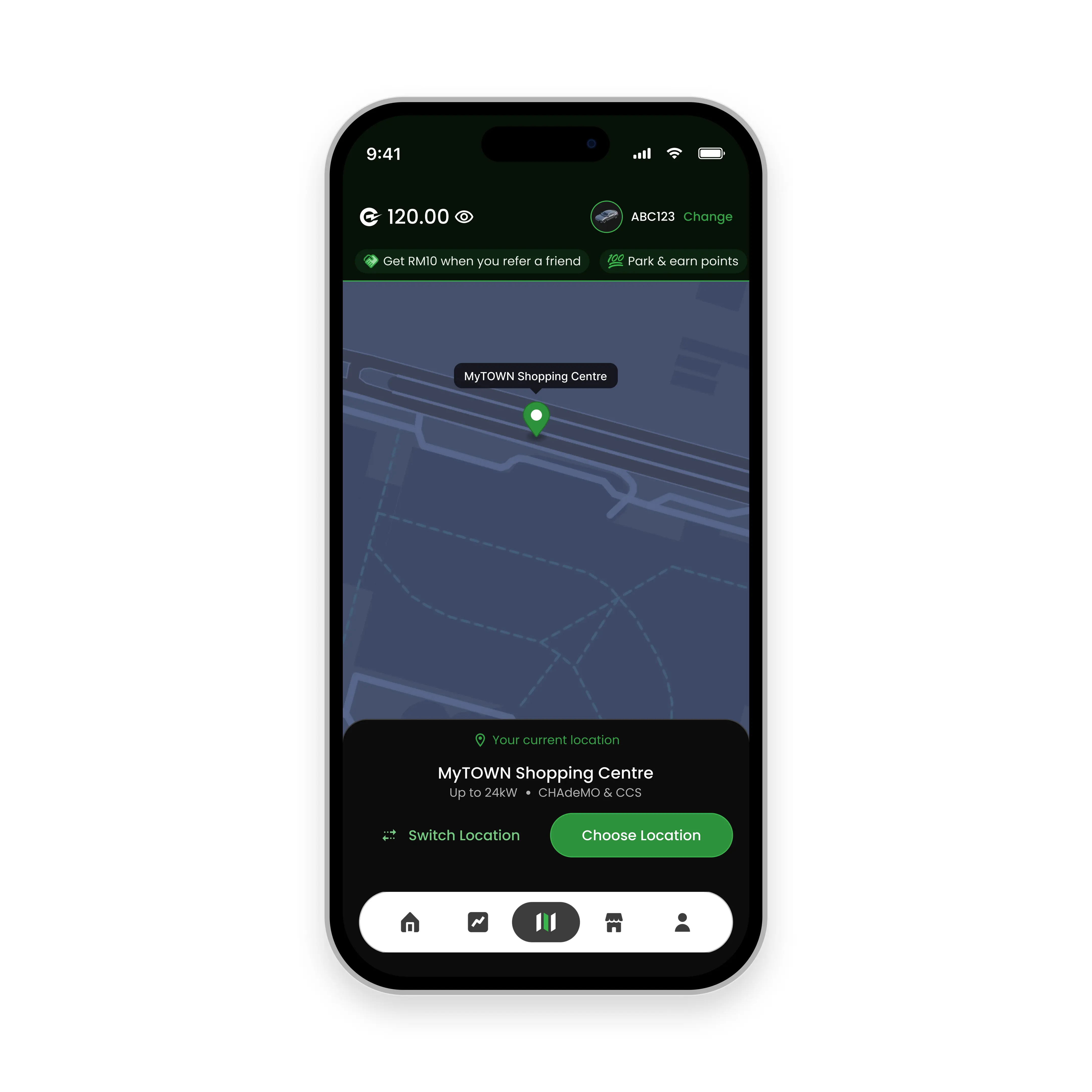
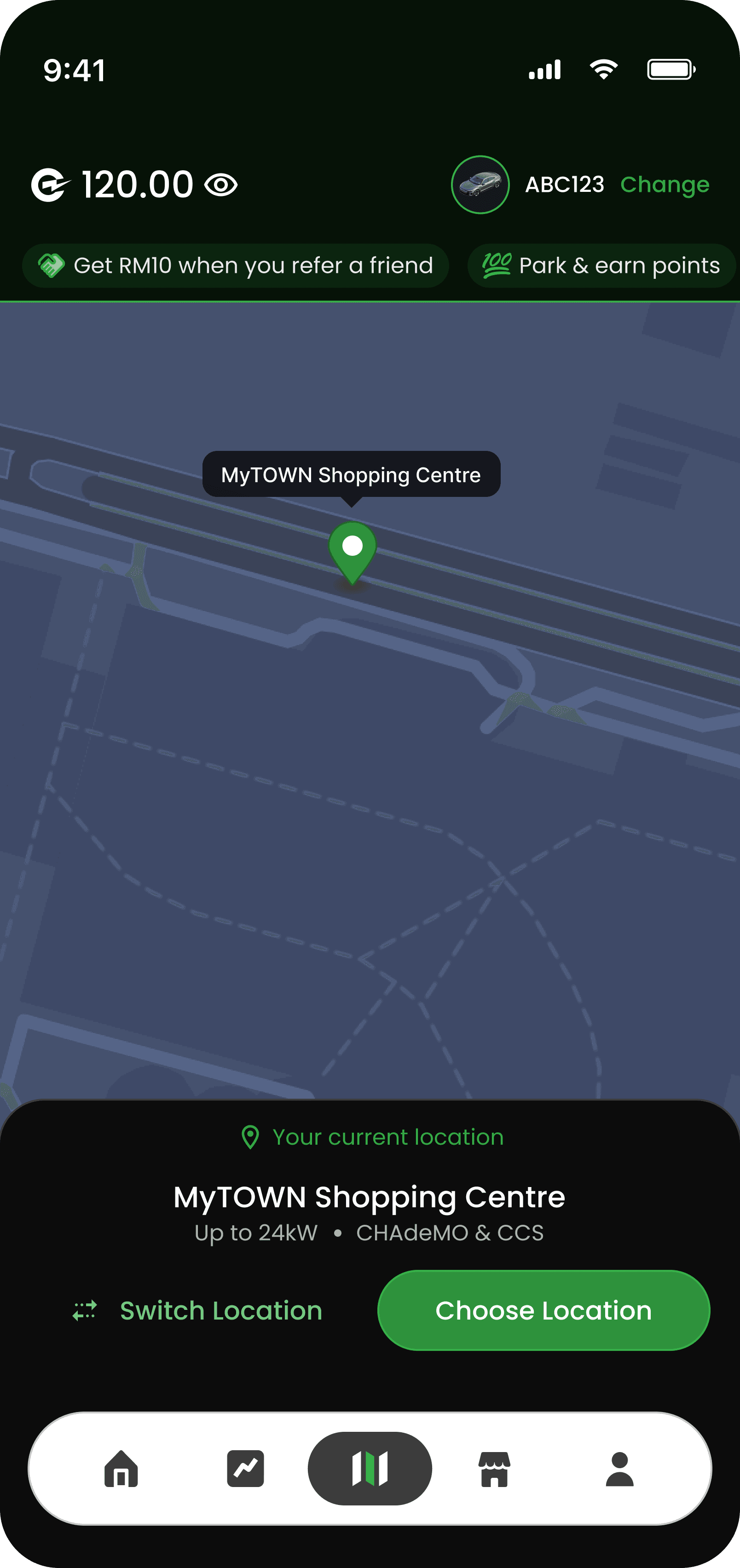
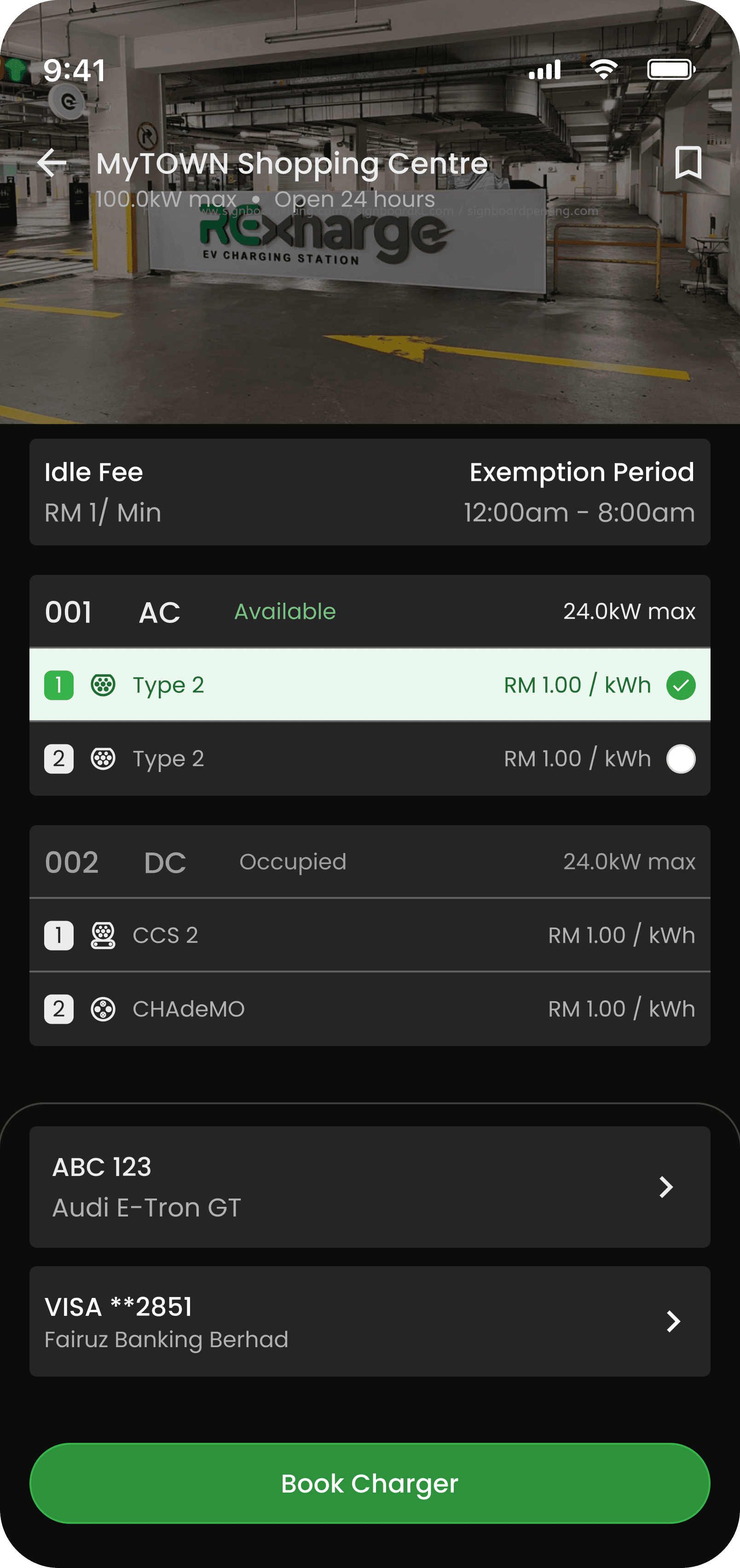
The answer was clear that they want to charge as quickly as possible. That shift in perspective changed everything. Instead of asking users to browse or decide, we designed the experience to act immediately. By detecting the user’s location, the app now pinpoints the nearest charger right away, allowing them to start charging with minimal effort. This became the primary action.

Exploration didn’t disappear, it simply became secondary. Only when users choose to go elsewhere does the app open up for browsing. By prioritizing immediacy over choice, the homepage evolved from a passive list into a decisive, action-driven experience.

Challenge #2

Can Marketing Promotions Be Invisible, Yet Effective?

Designing Promotions That Respect the User

The homepage didn’t start with a map but it started with a simple list of charging locations. At the time, we hadn’t fully figured out how the map experience should work, so we focused on what we could build: a functional list that helped users browse available chargers.

It made sense from a business perspective. But from a user experience standpoint, it raised a tension: how do we promote without interrupting?

We explored multiple directions. It started with full-screen promotional takeovers, impossible to miss, but also impossible to ignore. Then came lighter alternatives, like pop-ups, which reduced visual noise but still disrupted the flow. The challenge wasn’t just how to show promotions, but how often. Showing them every time users logged in quickly felt repetitive, even frustrating.

Full Screen version

Popup version 1

Final version

We moved toward a more balanced approach showing the promotion once, then giving it a persistent but unobtrusive presence within the app. Early ideas placed it within a drawer beneath the main call-to-action, but that made it too easy to miss. The breakthrough came with a simple shift: a ticker at the top of the screen.

It allowed promotions to stay present without competing with the user’s primary goal to charge quickly and move on. In the end, it wasn’t about choosing between marketing and experience, but designing a system where both could coexist.

Version 1

Example Version 1

Ticker Version

Example Ticker Version

Project Type

Vendor

Industry

Automotive

Role

UIUX Designer

Year

2025

r05.dev © 2025

You have the idea. Your audience has the need.

I design the connection between the two.

Contact me:

fairuz@r05.dev

Created by r05.dev